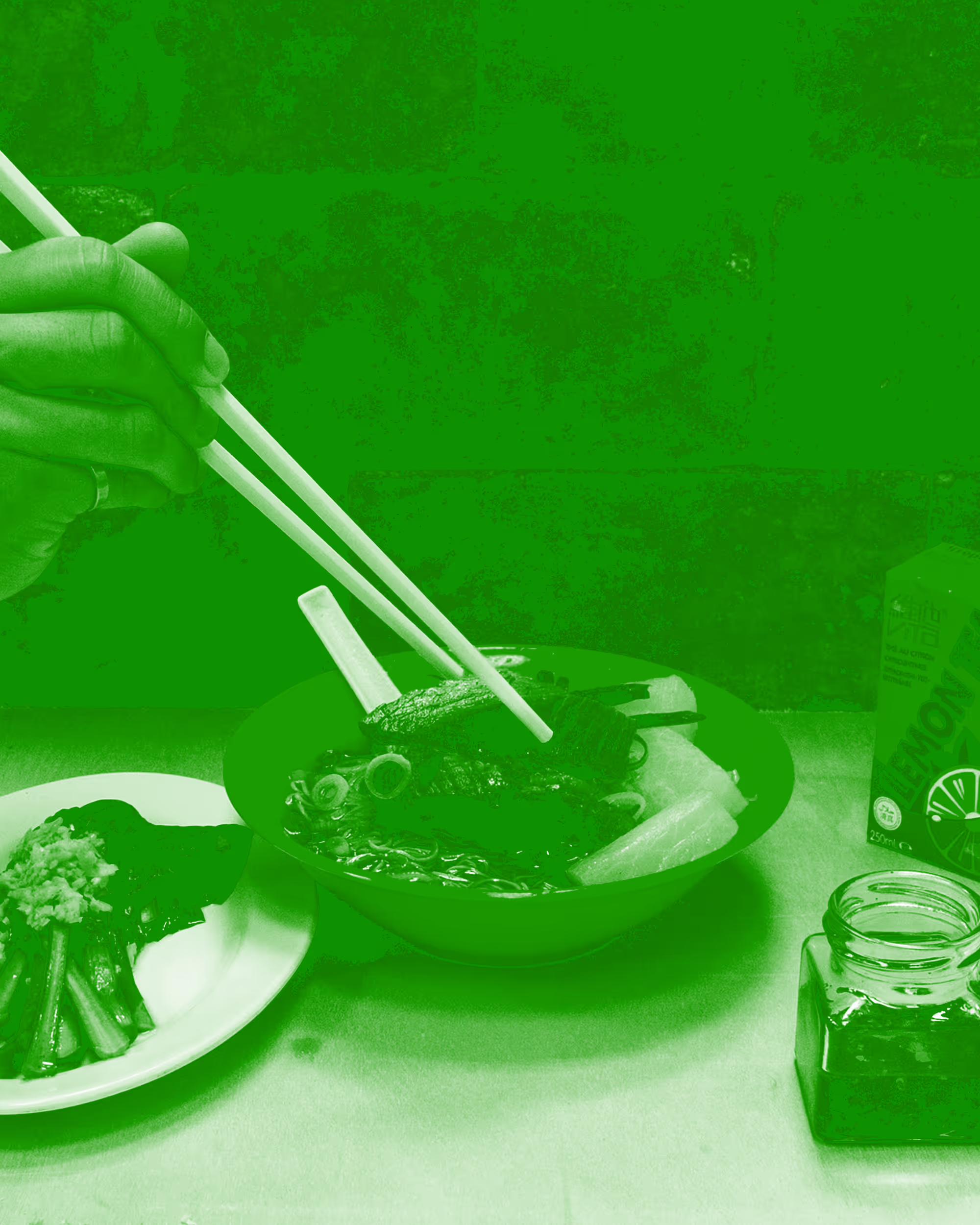
Celebrating Chinese Culture with Western Motifs

This project marked our first collaboration with PAIN CHAUD. For PAIN CHAUD, mid-autumn festival serves as an important festival for their seasonal and campaign driven products. Often brands stay safe by either using the traditional colours of red, yellow and green. From an imagery perspective, it is commonplace to see delicate images of lanterns, Chang’e, the rabbit and the moon.
When briefed by the Pain Chaud team for the 2023 Mid-Autumn Festival project, the aim was to create a premium mooncake packaging design capturing the playful personality of PAIN CHAUD whilst combining French elegance with Chinese culture. We took inspiration from the art style of “Toile de Jouy” to create the Mid-Autumn festival campaign celebrating the quality of Pain Chaud as an institution and celebrating Chinese culture with Western motifs.
The mooncakes performed exceptionally well by selling out completely! Through a unique visual design and enhancing the stories of Mid-Autumn Festival, we gave Pain Chaud an opportunity to express the brand identity in a way they had not done before.
中秋節對於如PAINCHAUD百丘一樣的餐飲品牌來說是一個重要的節日,尤其是那些推出獨創月餅產品的企業,好的營銷不僅可以吸引顧客,也可以構築品牌形象。如若希望使用穩健的策略,那麼傳統色系是不二選擇。從圖像的角度來說,以燈籠、嫦娥、玉兔或月亮為原型的創作更符合大眾的期待。
當PAINCHAUD百丘團隊與我們溝通2023年中秋節企劃時,他們的要求是高雅與活潑兼備,法式與中式兼得。我們以法國傳統的「Toile de Jouy」布料圖案風格為原型創作了一個中秋節宇宙,在體現PAIN CHAUD百丘優質形象的同時,也用西方母題改編了中國符號。
這款月餅禮盒效果絕佳,迅速銷售一空!獨特的視覺設計可以延展品牌的故事,這讓PAIN CHAUD百丘得以用此前從未嘗試過的方法來表達品牌的個性。